MoMA 2019, Part 1: Surrounds & Permanent Collections

Most visits to New York include a stop at the temple of modernism, the Museum of Modern Art (MoMA). But this was my first visit since the massive multi-year expansion and renovation was completed. In some ways, it seems that not much has changed, but in other ways it has changed considerably, starting the members-only entranceway leading to a larger and more open lobby.

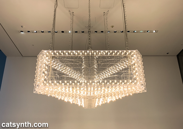
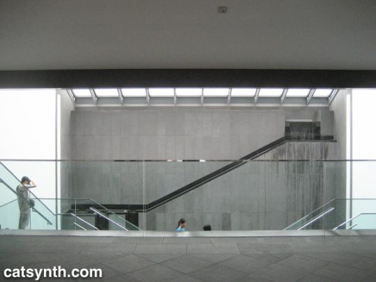
The second=floor atrium remains very much the same as it has been since the expansion in the early 2000s, a cavernous space looking up to all exhibition floors of the museum. It often is used to display monumental pieces or immersive performance works. Handles, a performance and sculptural piece by Haegue Yang combined both.

The name refers to the handles on all of the sculptural elements that allowed them to be slowly moved around the space by the performers. In between these motions, the performers gathered for vocal chanting that brought to mind the work of Pauline Oliveros. The sculptures and wall and floor elements had a simple geometric quality that reminded me of children’s building blocks. They also had bells and other sound elements mounted, again something that brought to mind Oliveros.


From the atrium, I always head immediately to the sixth floor and gradually work my way back down. The top floor featured Surrounds, an exhibition of large-scale installations by a diverse collection of contemporary artists. Some, like Mark MandersRoom with Chairs and Factory, were large singular pieces, with a gallery-sized replica of a factory. Others were large compositions of smaller elements. For example, Dayanita Singhs Museum of Chance was composed of numerous photograph prints made by the artist, assembled into large modular panels that could be easily rearranged in any number of configurations.

In his installation Architecture Is Everywhere, Sou Fujimoto challenges us to see the “architecture” in everyday objects. His installation is a field of small objects ranging from colored geometric design elements to potato chips placed on an array of pedestals.

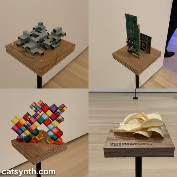
The “architecture” in each object is readily apparent when one is invited to see it. Even the potato chips are curvilinear forms that might be at home in a 1960s futurist public space.

Perhaps the most of fun of all the installations was Sarah Sze’s Triple Point (Pendulum). A colorful collection of everyday objects are arranged, somewhat precariously, around a circle as a pendulum swings freely above, threatening mayhem of destruction. However, that never happens and instead, we end up with an intricate but chaotic dance.

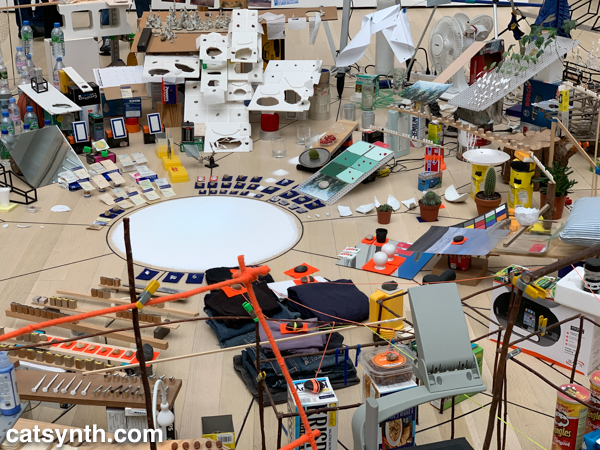
The name of the piece, which derives from the “triple point” where water can exist simultaneously as ice, liquid, and vapor, illustrates the sense mix of chaotic and coexistence in the installation.


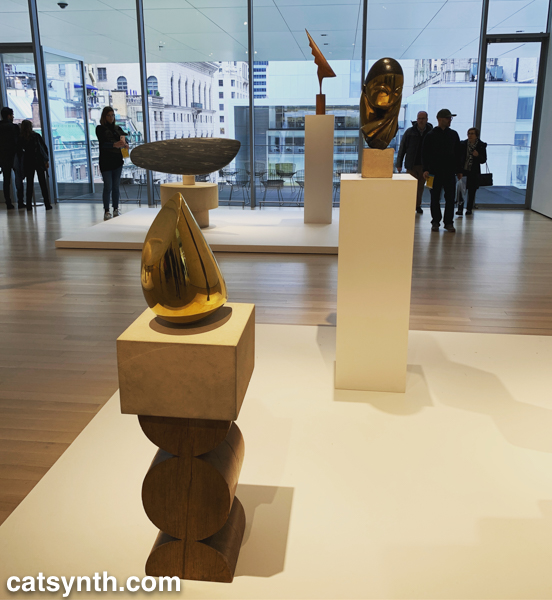
Descending to the fifth floor, some of the changes to the museum became more apparent. The terrace cafe overlooking the sculpture garden had been removed (actually, moved to a new location on the sixth floor), and replaced by an open gallery space showing various sculptures by Constantin Brancusi.

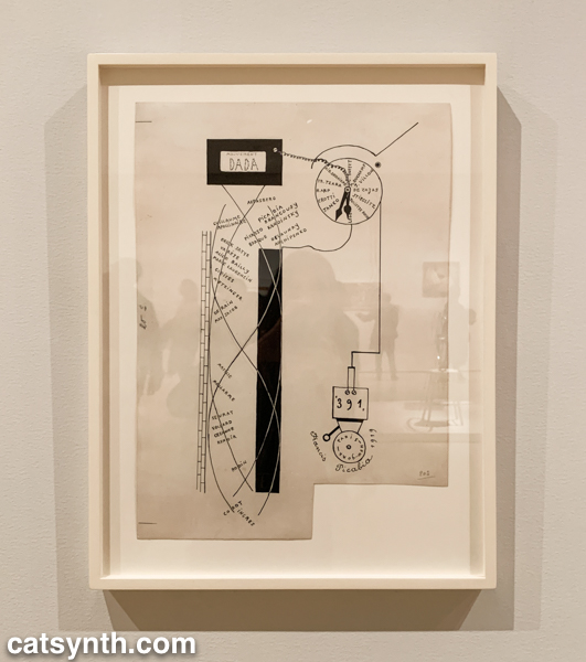
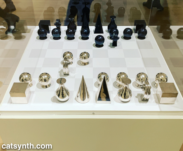
The remainder of the fifth floor and the entirety of the fourth floor housed an expanded and increasingly labyrinthine set of galleries for the permanent collection. The first gallery, which featured the oldest and most traditional works such as Van Gogh and Matisse, was by far the most crowded space in the entire museum. I quickly left to find some more open spaces and truly modern works, which began to appear in the 1910s and 1920s. In addition to Dada favorites, there were works celebrating machines, industry and the break with traditional forms of painting. Francis Picabia’s Dada Movement and Man Ray’s chess set are exemplars of these directions.
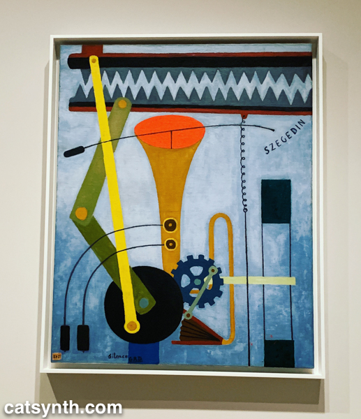
Georges Ribemont-DessaignesSilence depicts a musical instrument attached to machinery, perhaps speaking to the contradictory nature of music made by machines.

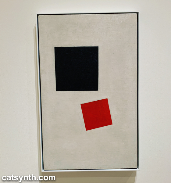
There was also a lively world of modernism and abstraction in Russia before the 1917 revolution, as exemplified by Kazimir Malevich’s minimalist Supremacist Composition: Airplane Flying.

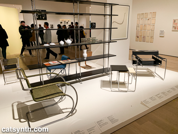
The expanded galleries included a room of design pieces from the interwar period (these were previously displayed in the separate design gallery on a rotating basis).

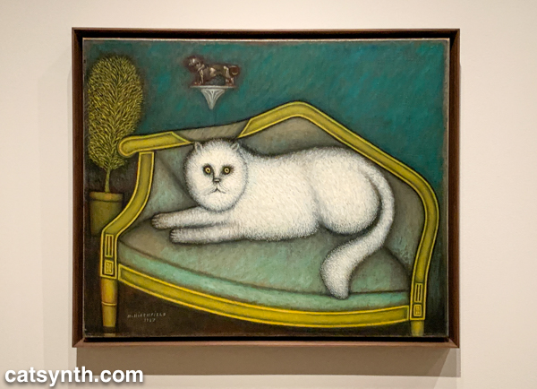
There was also a new space devoted to so-called “outsider artists” of the period, including Morris Hirshfield. I was particularly drawn to his portrait of a white cat titled Angora Cat.


The collection continued on the fourth floor with the period between the end of World War II and the 1970s. This is usually my favorite section to linger in, with many iconic works of the 20th century. The Jackson Pollock’s are of course back on full display, but so is Lee Krasner, who is finally getting her due as a leading abstract expressionist painter.

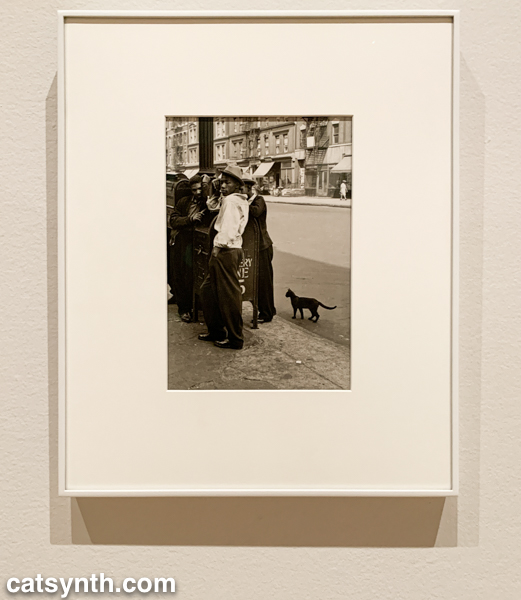
The expanded galleries have given more room for women and other underrepresented artists. The photography of Helen Levitt was featured in a room that also included artists depicting life in Harlem in the 1950s. I particularly liked this photograph of hers with a black cat.

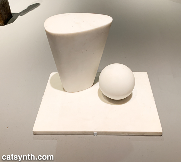
This sculpture by Barbara Hepworth is quite minimal, with the perfection of the sphere balancing with the “squishier” curves of the taller element.

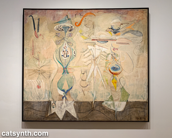
There were also pieces that showed the works of artists beyond their most well-known. I would not have guessed this painting with other-worldly plant-like creatures as the work of Mark Rothko were it not for the title card.

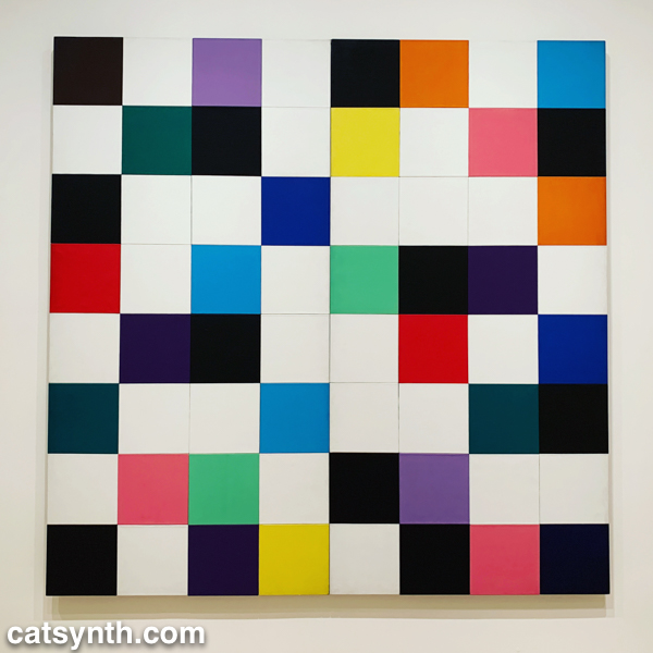
There were of course pieces that did exemplify artists as we know them. Ellsworth Kelly had large geometric blocks of color, as one would expect.

I looked around these galleries in vain for perhaps my favorite work in the collection, Piet Mondrian’s Broadway Boogie Woogie – it’s like visiting an old friend when I see it – but it was nowhere to be found. [Spoiler alert: I did eventually find it and it will be featured in Part 2 of this series.]

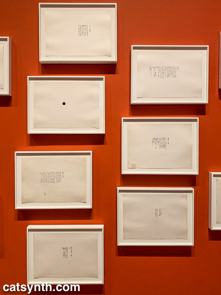
As we move into the late 1950s and the 1960s, abstract expressionism gives way to more conceptual art and works in different media. This was the beginning of Fluxus, with its instructional pieces, happenings, and ephemeral works on cheap materials. There was an entire wall of “scores” for performance works by Yoko Ono. These are always fun – most have clear instructions that one could use to perform them today, though I wonder what was expected from the large black dot.

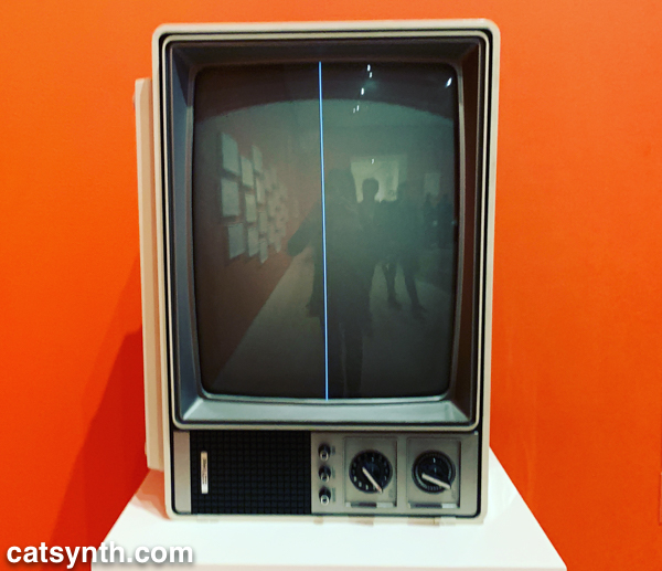
This is also the era of Nam Jun Paik’s experiments with analog video. Zen for Television takes video art to its most minimal, with a single line of a continuous signal on the screen. However, the vintage television set itself becomes a specific idea when viewed in the 21st century.

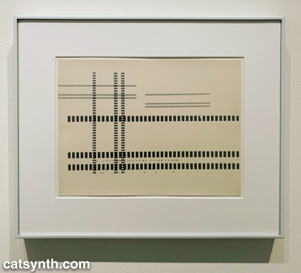
Abstract designs persist in this period, but also take on an industrial and repetitive nature. Sol Lewitt takes this to the extreme, but others Geraldo de Barros left room for variation, and perhaps to the works on paper from Fluxus.

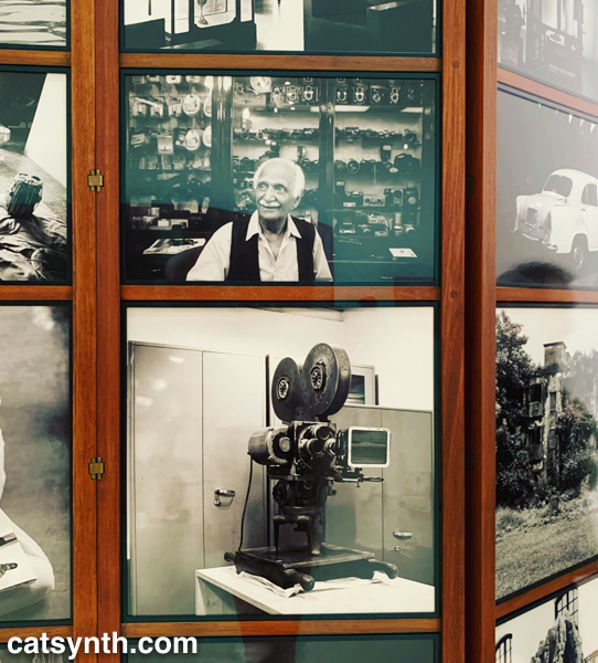
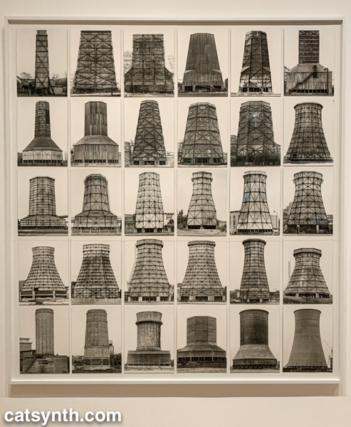
Among my favorite photographers of this period are Hilla and Bernd Becher. There work depicting old industrial buildings and placing them into artistic compositions has been a huge influence on my own photography.


Even after this whirlwind through three floors, seven decades, and multiple exhibits, there was still much of the museum to cover; and I was determined to cover the entirety in one day. In the end, I succeeded, and the remainder of the visit will be covered soon in Part 2 of this series.

(Almost) Wordless Wednesday: An Exercise in Contrasts

Posing with my friend and collaborator Serena Toxicat at the Outsound benefit dinner a couple of weeks ago. Although about the same height, size, and silhouette, our color and texture were true contrasts. Black vs white, solid vs patterned. Yin and yang.

You can see our video from the performance at the benefit dinner below.

Art on Father’s Day

For Father’s Day, we have some “patrilineal” art to share. This assemblage was created by my dad, combining a painting of his with a handkerchief that belonged to my grandfather. The material of the handkerchief is decades old and decaying, and the tears and texture make for a very interesting blend with the colors and shapes of the painting below.

We at CatSynth wish a happy Father’s Day to all the human and feline dads out there.

I.M. Pei in Suzhou and Beyond

The second of our remembrances focuses on the architect I.M. Pei, who passed away this week. A true champion of modernism worldwide, I have admired his work both from afar and close up.

Perhaps the most vivid memory with his work was from the Suzhou Museum in Suzhou, China. It may not be his best known work, but it is a masterpiece in itself and a love letter to his hometown.

The exterior facade combines Pei’s trademark geometry and minimalism with more the more traditional designs and tropes of an adjacent palace and Suzhou’s famous gardens. It also makes extensive use of water as an architectural element both inside and outside the building.

The simple geometric shapes, as well as the use of water, stone, and glass, gave the entire complex a very warm and welcoming feeling, even as the rain came down around me. Inside, the simplicity of the galleries left ample mental space to enjoy the exhibits and artifacts, while the atrium was a work of art itself.

I admire the way he often brought modernist aesthetics and principles to traditional spaces. This is perhaps most dramatically seen in his glass pyramid that anchors the Louvre Museum in Paris.

Napoleon courtyard of the Louvre museum at night time, with Ieoh Ming Pei’s pyramid in the middle. Benh LIEU SONG [CC BY-SA 3.0], via Wikimedia Commons

The pyramid is perfect, a stark contrast to the severe facades around it, and perfectly balanced in size and space. While I know many traditionalists have hated on this addition over the years, I for one love it. I am an unapologetic modernist and often find myself sparring with traditionalists even here in San Francisco.

Pei’s modernism was intended to integrate with its surroundings, even as it stood in contrast to it. For example, he wanted his stark geometric design for the Mesa Laboratory at the National Center for Atmospheric Research (U.S.A.) to look “as if it were carved out of the mountain”.

Until reading others’ tributes and remembrances, I had forgotten about his role in the Javits Center in New York, a building I am quite familiar with both inside and out. It is a massive and imposing structure but crisscrossed with triangular details that remind me of the Suzhou Museum (built 20 years later). The project was plagued by challenges and controversies, and “during the inauguration ceremonies, however, neither [James] Freed nor Pei was recognized for their role in the project.” [source]

Jim.henderson [Public domain], via Wikimedia Commons

Triangles do seem to be a major recurring theme in his work, and perhaps part of why it appeals to me even within the scope of other modernists. Triangles are powerful and strong, and the often stand out in Western spaces dominated by rectangles. These elements also played a role East Building for the National Gallery in Washington, D.C., a project is loved by many, but similar to the Louvre, criticized by some traditionalists.

The building is a masterpiece of minimalism. Even some of those traditionalist critics have grown to love it in the years since it opened in 1978. And it serves its purpose, both as a home to art and a work of art itself.

The growing popularity of art museums presented unique challenges to the architecture. Mellon and Pei both expected large crowds of people to visit the new building, and they planned accordingly. To this end, he designed a large lobby roofed with enormous skylights. Individual galleries are located along the periphery, allowing visitors to return after viewing each exhibit to the spacious main room. A large mobile sculpture by American artist Alexander Calder was later added to the lobby.[93] Pei hoped the lobby would be exciting to the public in the same way as the central room of the Guggenheim Museum in New York. The modern museum, he said later, “must pay greater attention to its educational responsibility, especially to the young.”[94]

https://en.wikipedia.org/wiki/I._M._Pei#National_Gallery_East_Building,_Washington,_DC

Defending modernism, even after a century, remains a tireless job. As we lose champions like I.M. Pei, it falls to those of us in later generations to make sure this beauty is preserved and celebrated.

Julius Caesar by Théâtre National de Bretagne

Today we look back at Théâtre National de Bretagne’s unusual production of Shakespeare’s Julius Caesar. We at CatSynth had the opportunity to see it at Zellerbach Hall in Berkeley, California a couple of weeks ago.

It is a play we know well, having read the original and recently revisited Joseph L. Mankiewicz’s epic 1953 film version starring Marlon Brando, James Mason, and John Gielgud. In contrast to that version which places the play in a grand realization of ancient Rome with large sets and hundreds of extras, this production directed by Arthur Nauzyciel with set design Scott Zielinski, was abstract and spare: a mostly empty stage surrounded by a backdrop of empty theater seats. The cast was stripped down to a small set of players, some pulling multiple roles – both Portia and Calpurnia were played by Sara Kathryn Bakker, for example. Their costumes (by James Schuette) were inspired by the 1960s, as were the furniture. We see the characters as mostly upper-class individuals in suits and dresses in spare rooms with modernist furniture, something directly out of Mad Men. We first see Brutus (James Waterson), Cassius (Mark Montgomery), and Julius Caesar (Dylan Kyussman) in simple tuxedos, with Mark Antony (Daniel Pettrow) bounding in wearing an Adidas tracksuit – a nice touch that harkened back to Brando’s jockish first scene as Antony in the 1953 film. One cannot consider these things anachronistic, seeing as how the Shakespeare play in itself is an anachronism, with its mentioning of clocks, doublets, etc., not to leave out the fact that it was written and generally performed in English.  The drama is what is most important in the play, the interaction of the characters, and the mechanics of politics and public opinion. 

Theatre is fundamentally about illusion and representation.  Sometimes, perhaps most of the time, in older forms of theatre, minimalism accentuates the essence of what a dramatic piece is trying to convey.  All of the information is conveyed through the words and actions, with the dressing secondary.  As I believe it should be with Shakespeare.  So I felt the right tone was taken with the way the visual aspect was handled.

Sara Kathryn Bakker as Portia. Photo by Frédéric Nauczyciel.

Of course, the central element of such a play is the acting and interpretation of the text. Kyussman’s portrayal of Caesar brought the right mixture of pomp and gravitas to his character.  Waterson’s Brutus came across as conflicted in his feelings, ultimately choosing reason over loyalty. And Montgomery’s Cassius was a thoughtful but odd fellow. Bakker’s double-duty as Portia and Calpurnia was beautifully played but also served to highlight the overall lack of women characters in the play. Something I was ambivalent about was the decision to excise the scene with Cinna the Poet, and his being swept up by the angry mob and killed, having been confused with Cinna of the conspirators.  This scene is excised from many stage productions and most films of the play, for purposes of pacing, which is unfortunate.  I feel it is a crucial scene which shows the madness of crowds, the way opinio publica can be twisted by those who seek to further their own ends = “The abuse of greatness is when it disjoins remorse from power”, indeed.

The lighting was also a major player in this production. For most of the early scenes, the stage was shrouded in a mixture of darkness and low lighting. It is only when we get to the Capitol and the chamber of the Senate that the lights become bright, drawing us to a very stylized and choreographed assassination of Caesar. This continues into the speeches of Brutus and Antony before changing again into an eerie fog-filled atmosphere for the war scenes of the final act.

The assassination of Caesar. Photo by Yann Peucat.

Perhaps the most unusual aspect of this production was the use of a live jazz trio, who performed between acts, and occasionally between scenes. The musicians (Marianne Solivan on vocals, Dmitry Ishenko on bass, and Leandro Pelligrino on guitar) were all top-notch and performed extremely well.  But we were anticipating original music.  What was presented was a selection of standards.  In itself, this was not disappointing – and the joining in by Bakker as Portia and Montgomery as Cassius was fun.  However, the selection of pieces – which, lyrically, commented upon the action with a winking, postmodern irony – in some ways undercut the otherwise serious and austere quality of the production and interpretation of the play. After the scene between Brutus and Portia, we were given “You’ve Changed”.  In the entr’acte, we heard “Is That All There Is?”  I felt by the end of the performance, it had become something close to a parody.  

This sense that the music played against the other dimensions was highlighted in the final song-and-dance number, set to some recently recorded, faceless, autotuned pop song (I’m pretty sure it was a Lady Gaga song, but I can’t confirm). It really seemed to be negating much of what I feel is at the core of this play, very serious ideas about morality, duty, and civic responsibility.

This may be the director’s intention, I don’t know for sure, and I can’t say.  The director took many chances with the production and created a fairly unique take on a work which has been performed so many times, in different ways.  “How many ages hence shall this, our lofty scene, be acted over in states unborn and accents yet unknown”, indeed.

Overall we enjoyed the performance, the design, and the acting. And I like to see productions of Shakespeare’s plays take chances with new directions rather than simply redoing the same thing over and over again. But with any experiment, sometimes things work and sometimes things do not. The end result here was mixed and ambiguous. But perhaps that was the point.

[Jason Berry contributed to this review.]