Codex Seraphinianus

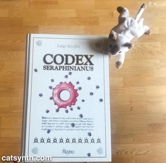
We at CatSynth have been fascinated with the Codex Seraphinianus long before this beautiful edition made its way to CatSynth HQ.

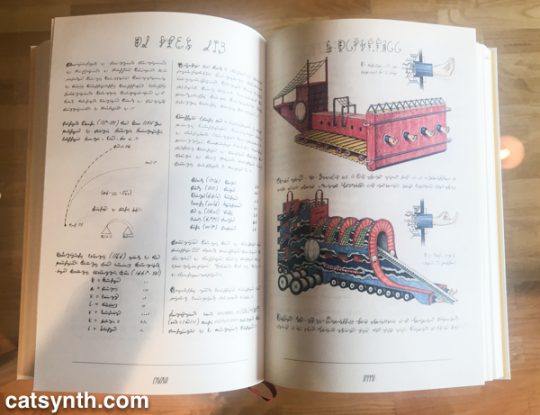
The Codex is a masterpiece of book art by Italian artist, architect and industrial designer Luigi Serafini. It is an illustrated encyclopedia as a handwritten manuscript with hand-drawn color illustrations depicting a surreal imaginary universe of objects, creatures and concepts.

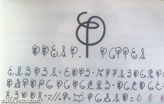
Most interesting of all, it is written in a completely invented script.

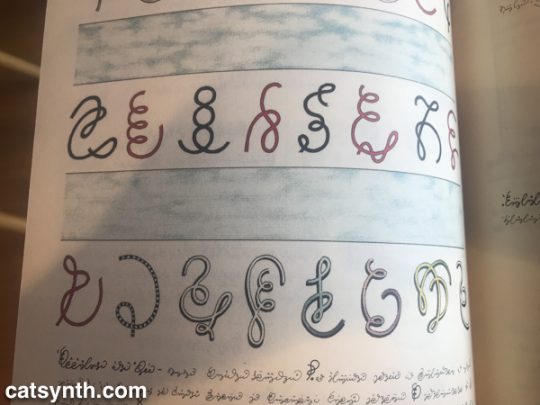
The script, consisting of squiggles and dots, sometimes detached and sometimes cursive, resemble a Western, Semitic or South Asian script, but one entirely of Serafini’s own imagination. It is easy to pick out repeated letters, such as the “E-like” character with one dot in its lower section; and curve-on-a-stem that appears to serve as a singular character in many portions of the first book.

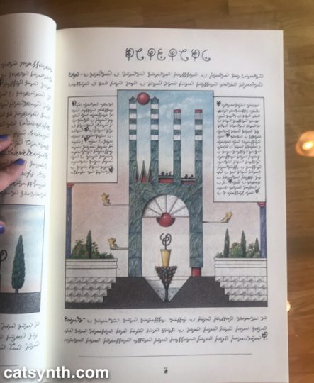
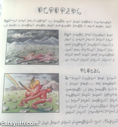
Even without knowing the full meaning of the script or the illustrations, one can start to discern meaning. For example, on this page it is pretty clear that this creature tends to wilt (perhaps even suffer) in rain, but thrives in sunshine. (This is something I can sympathize with.)

Serafini himself has declared the writing in the Codex to be asemic, without a specific structure or meaning. And while I take him at his word, one cannot help but construct meaning from both the images and the writing. I have long been fascinated by other alphabets and writing systems and been able to find patterns (and even learn them to some degree) independent of the languages they represent. For example, I was able to learn a bit of the Tamil script when traveling in South India in my youth, though I never learned the sounds or the language. Similarly, I began to pick up Sinographic characters in my time in China but with no knowledge of how to pronounce most of them.

It is in this vein that I have begun to read the Codex from its start, treating it as a pure work of art with text and illustration as its medium. It’s actually a pleasurable and captivating experience to pour over the text and spot the patterns without being confined by the need for meaning. I made it through the first book (plants and anthropomorphic flora) and a bit into the second (animals). It is the fourth book (physics, chemistry) and the fifth (machines) that I most curious to “read” in depth, but I will take my time to get there.

Anthony Discenza: Everything Will Probably Turn Out OK

With the month-long string of performances mostly behind me, I am trying to work my way through my backlog of reviews. Today we at CatSynth present a recent exhibition by artist Anthony Discenza at Catherine Clark Gallery entitled Everything Will probably Work Out OK. That phrase has become a bit of a mantra since the exhibit, and I keep the original card on my desk, reminding myself as I work on my music or other projects that “everything will probably work out ok.” It might not, but it probably will.  Additionally, the card, with simple black lettering on a white background, appeals to my interest in text-based art – indeed, the relationship between text and image was a central theme of the exhibition.

I particularly liked his series of “street signs”, which featured cryptic and humorous messages in the familiar rectangular shape and sans-serif type of signs used in American cities.

[Anthony Discenza, KITTENS and DIRTIER, 2009.  Photographs courtesy of Catherine Clark Gallery.  Click to enlarge.]

In addition to the gallery presentation, several of the signs were posted on streets (prior to the exhibition). In the example presented here, A LAPSE INTO THE ROMANTIC, one can see how the signs really fit the part in terms of scale, design, layout and type.

[Anthony Discenza, Lapse into the Romantic, 2007.  Photo courtesy of Catherine Clark Gallery.  Click to enlarge.]

With just a peripheral glance one could easily assume this is just another sign explaining some parking or traffic rule. A selection of the street signs were also featured in the exhibition catalogue.

Another prominent series featured plays on the “Hollywood elevator pitch”, where someone attempts to summarize their idea as “A meets B”. In Sometimes a Great Notion (Part 1). Discenza presents a wall of absurd pairings drawing from pop culture, literature, history and other sources.  Examples include “It’s M.C. Escher meets Z. Z. Top”, “It’s Le Corbusier meets Chuck Norris”, “It’s Star Trek: The Next Generation meets The Indigo Girls”, and “It’s Twitter meets SARS”. You can see a full version of the text from the piece here. He also has some extended chains as light boxes:

[Anthony Discenza, Teaser #1, 2009. Photo courtesy of Catherine Clark Gallery. Click to enlarge.]

In addition to the visual pieces, there was also an audio installation Untitled (The Effect). In a dark room with low lighting, a disembodied female voice narrates a text describing visuals or instructions that seem disjoint but also seem to flow naturally. The text is based on fragments gathered by searching for a specific phrase on Google.

Although this quote from the press release seems to most describe the audio work, it could easily apply to the visual text-based pieces as well:

I’m very interested in text—in part because I’ve always drawn so much inspiration from literature—and specifically for the way that text can act as a kind of score, enticing the mind to construct things that don’t exist anywhere else. I’m curious about that peculiar fluidity of something experienced primarily in the imagination, and I’m fascinated by the way a small fragment of something—maybe only a few sentences, or even just a phrase—can, under the right conditions, conjure an entire narrative.

Discenza is also known for his past work which features meticulously edited and constructed video work. The exhibition does include one piece Charlton Heston: The Future Has Already Been Written in which he intersperses several Charlton Heston films on a frame-by-frame basis. It takes a moment to get used to seeing the rapidly changing images, but once one’s eyes and brain adjust, scenes and transitions become clearer (and I quickly recognized Planet of the Apes).

SF Recology Artists in Residence

Last Friday, I attended an exhibition for the Artist in Residence program at Recology San Francisco (formerly known as, SF Recycling & Disposal, Inc.). Yes, this was an art opening at the SF dump. The program has been around for almost twenty years, and provides space and support for artists who work with materials from the city’s waste stream, including recycled wood, paint and metal. Pretty much anything the artists can scavenge. This exhibition marked the end of the residency for artists Erik Otto and Christina Mazza.

We first enter the gallery through an anteroom, with some smaller works including Erik Otto’s Rebuild, featuring the title word cut into scrap paper (including a musical score and furniture assembly instructions) and illuminated by a recycled light box.

Erik Otto. Rebuild, 2010. (Click to enlarge.)

The title and the materials of this piece set the tone for the show. In addition to my standing interest in text as a visual element, I liked the inclusion of music as part of its texture.

Moving into the main room, one immediately sees Otto’s Road of Prosperity (The Start of a New Beginning), with over one hundred small wooden houses suspended from the ceiling on fishing line, forming a chaotic spiral that descends towards the ground.

[Erik Otto.  Road of Prosperity (The Start of a New Beginning), 2010.  (Click each image to enlarge.)]

The houses, made of recycled wood, all have a similar iconic shape. Stepping back, one can see the the wooden frame at the base is itself another house. Indeed, the houses reappear throughout Otto’s work, either as central or peripheral elements, in his paintings and mixed media pieces and even in a video installation featuring recycled television sets:

Erik Otto. In the Abundance of Water, We Are Still Thirsty. (Click to enlarge.)

I am drawn to recurring icons in a series of work. So what is the significance of the houses? Certainly, they are a symbol of our current economic crisis, and a very visible part of natural and human-made disasters. Otto’s own words are informative:

My work is a narrative told by the recurring characters/elements I use often in my artwork. The house is a physical embodiment of our spiritual being. Inspired by the notion that being home is “knowing” – knowing your mind, knowing your heart – that if we know ourselves, we are always “home”, anywhere. It is often depicted in chaotic landscapes and is found seeking safety from a storm and/or rising water levels, which refer to our current social and economic climate.

His paintings, which also prominently feature the houses, include other elements such as found text, such as the “OPEN” sign in the large painting Moment of Reflection. Devotion 5 features a house (perched on stilts above a body of water) painted over book covers and a Scrabble board – certainly a powerful symbol of out-of-context text.

Erik Otto. Moment of Reflection. (Click to enlarge.)

Erik Otto. Devotion 5. (Click to enlarge.)

While Erik Otto’s work seemed to focus on discrete elements, icons and text, Christina Mazza’s pieces were about more continuous textures. Many of her finely detailed drawings feature entanglements of string or rubber bands or rope.

Christina Mazza. Construction. (Click to enlarge.)

She takes this theme of complex tangles to a larger scale with this wall piece made of shredded packing paper.

Christina Mazza. (Click to enlarge)

Mazza presents a very different texture with Redemption: SF Dump, which features a video inset in a wall made of brightly colored wood panels. Up close, one can see the imperfections, nails and slightly off angles of the the recycled wood. From a distance, it can seem a texture of precisely generated color rectangles with a moving image at the center.

Christina Mazza. Redemption:SF Dump. (Click to enlarge)

Mazza found inspiration in the discoveries she made at the dump, and documents her adventures on her blog. Looking through the images, I can see piles of discarded items that served as “subjects” for her drawings. One image which I found interesting but was not reflected in the pieces at the show was a discarded Chinese paper frame .

Christina Mazza. Chinese paper frame.

I find this image a fitting conclusion as I turn my attention to other recently visited exhibits and my own upcoming projects.

Thanks to Recology SF for providing many of the photos for this article. You can see more pieces from this exhibition and previous artists in residence at their flickr site.